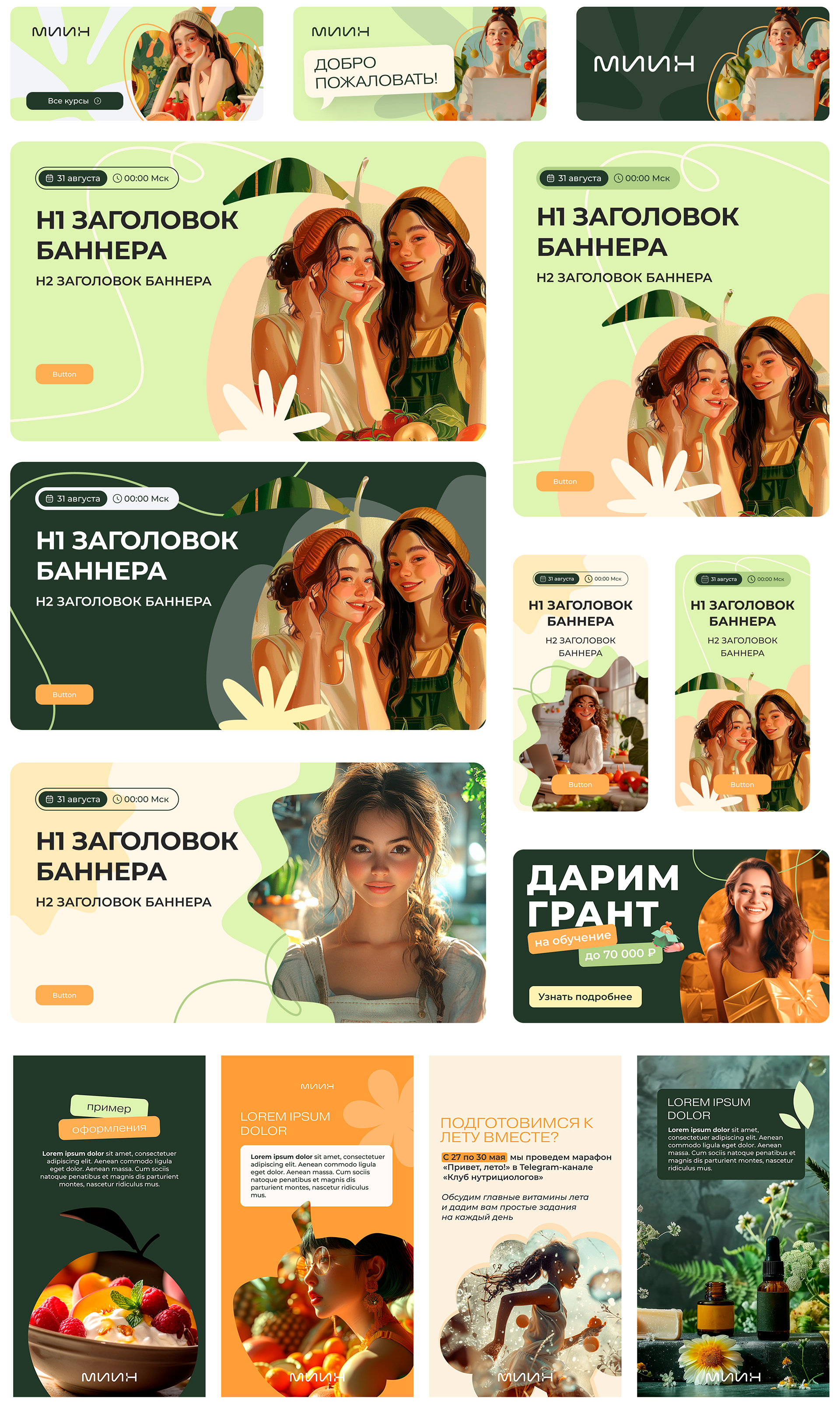

The team's objective was to reimagine the visual identity to emphasize natural authenticity, sustainability, and organic beauty, deliberately distancing itself from associations with medicine, the beauty industry, and pharmaceuticals. The goal was to evoke a sense of connection to a community embracing a holistic, health-conscious lifestyle independent of pharmaceutical products.
How we did it:
- Rich natural color palettes with layered, earthy combinations
- Minimalist shapes and organic textures
- Photography and illustrations in warm, inviting tones
This approach reinforces themes of simplicity, environmental harmony, and wellness rooted in nature rather than synthetic solutions.
- Rich natural color palettes with layered, earthy combinations
- Minimalist shapes and organic textures
- Photography and illustrations in warm, inviting tones
This approach reinforces themes of simplicity, environmental harmony, and wellness rooted in nature rather than synthetic solutions.
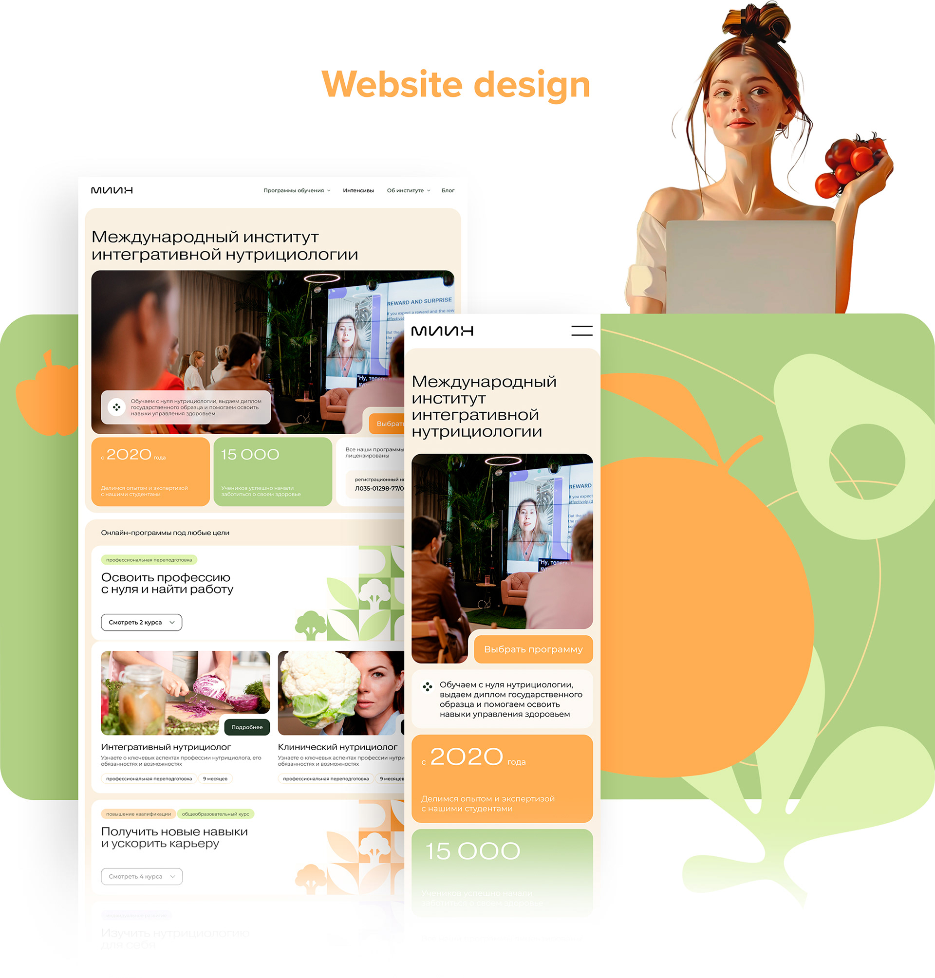
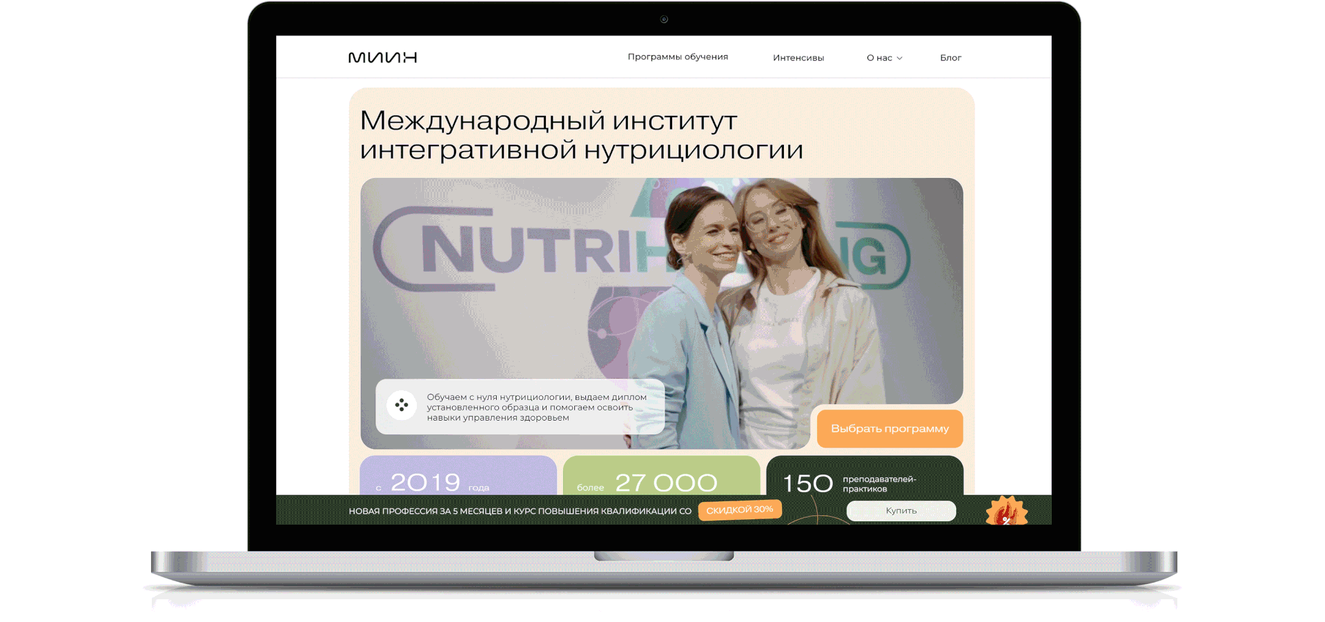
Based on Tilda, we created the pre-built multi-channel templates. The new platform empowers school managers to publish advertisements, update promotion terms and track analytics independently of the design department.
Staff is able to access the design team's open resource media hub to:
- Deploy pre-configured templates with brand-compliant specs
- Generate launch-ready materials for campaigns
- Execute 60%+ of tasks without designer involvement
- Deploy pre-configured templates with brand-compliant specs
- Generate launch-ready materials for campaigns
- Execute 60%+ of tasks without designer involvement